
Turning Cards into Conversations: Don't Be Invisible
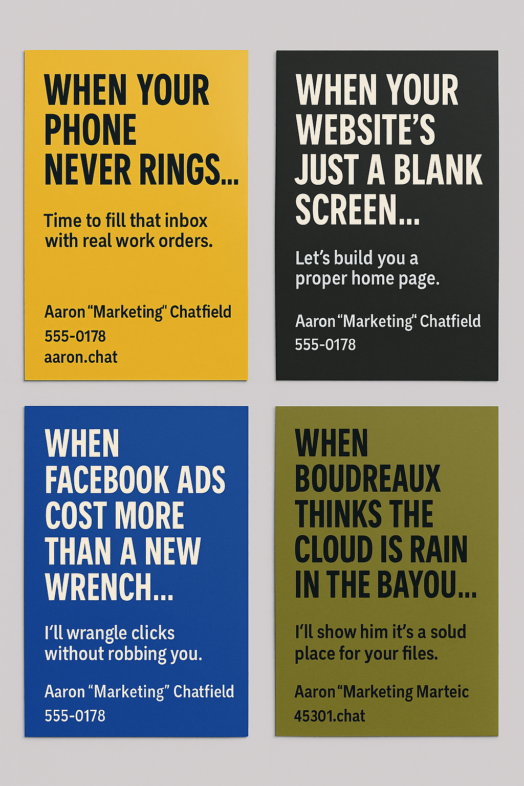
I’ll be honest—I’ve handed out more boring business cards than I can count. They list my name. My title. My contact info. And then vanish into someone’s junk drawer. So when I set out to design my latest card, I asked myself: How do I make people stop, squint, and actually remember me?
Choosing Curiosity Over Convention
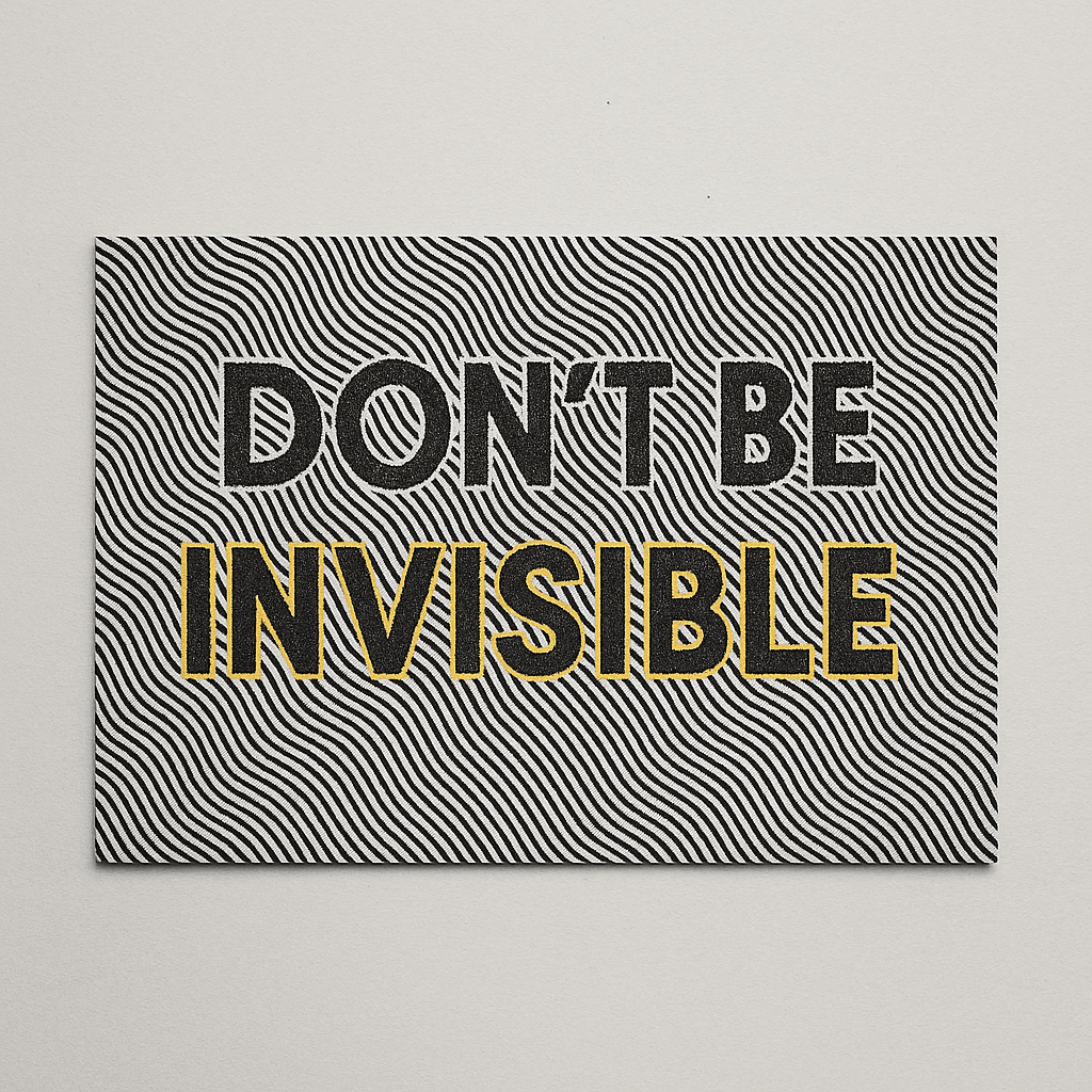
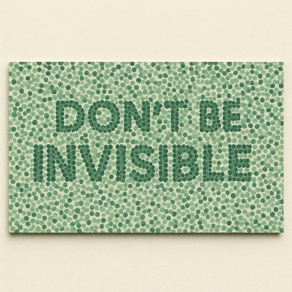
I ditched the usual one-glance approach and leaned into an optical illusion. By hiding “Don’t Be Invisible” in an autostereogram, I forced prospects to interact. That moment they squint and unlock the message? That’s gold—I’ve captured their full attention, not just an eyeball skim.
Inviting a Physical Interaction
Rather than just hoping they glance, I dare folks to twist, tilt, and squint because a little hands-on fun beats another passive glance any day.
Tilt & Twist: Instead of passively glancing, people have to hold the card at the right angle.
Built-In Icebreaker: Almost everyone asks, “How’d you do that?” and boom—we’re talking marketing strategy before they even realize it.
Reinforcing My Brand with Color
I didn’t pick green just because it’s pretty; those exact shades are a deliberate nod to trust, growth, and my Hey Aaron! Marketing vibe every time someone sees them.
I stuck to my palette—mint (#D1E8D3), forest (#2A6C51), and sage (#83C0A0)—for a reason:
Trust & Growth Vibes: Greens say “I know my stuff and I’ll help you grow.”
Comfort in Contrast: The softer midtones meant the hidden phrase felt like a secret reward, not an eye strain challenge.
Every time someone sees those exact shades, I hope they think of Hey Aaron! Marketing.
Behind the Scenes of My Process
Before you got the finished magic-eye effect, there was sketching, scripting, and print tests—here’s how I turned code and color into a conversation starter.
Depth Mapping: I started by sketching the letterforms in 3D so “Don’t Be Invisible” would pop at the right depth.
Pattern Play: I overlaid random dots and lines in my brand colors.
Coding the Illusion: A quick Python script married the depth map to the pattern, calibrating how far the hidden text sits behind the “surface.”
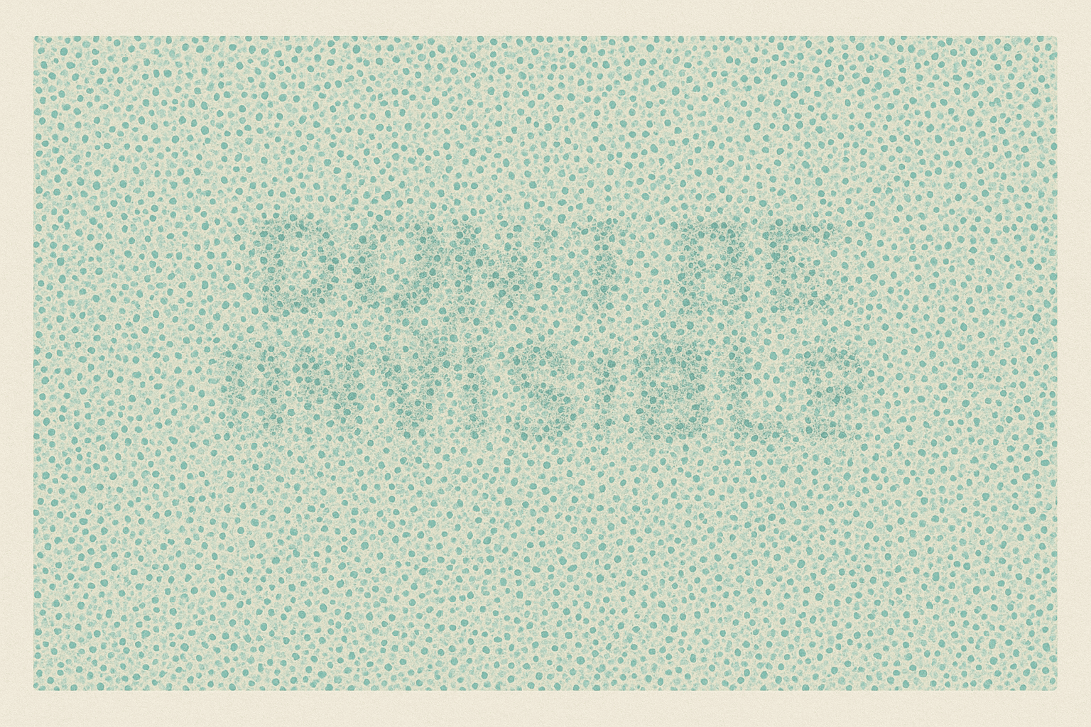
Print Tests: I printed low-res prototypes, tweaked dot density, then ran full-res tests under different lights until the reveal felt just right.
Finding the Sweet Spot
It took a few too-easy and too-tough prototypes before I landed on that golden “ah-ha!” moment—let me show you how I calibrated just the right amount of mystery.
Too Obvious? First drafts jumped right out—so I dialed up the noise.
Too Hidden? Later versions needed a minute-long stare—so I softened the midtones around the letters.
The goal: that satisfying “aha!” moment exactly three seconds in.
How I’m Going to Measure Success
I’m not leaving this to gut instinct—I’ve set up QR codes, UTM-tagged links, and call-tracking so I can see exactly how folks engage, plus I’ll capture in-the-moment reactions and blog feedback to gauge real-world sentiment.
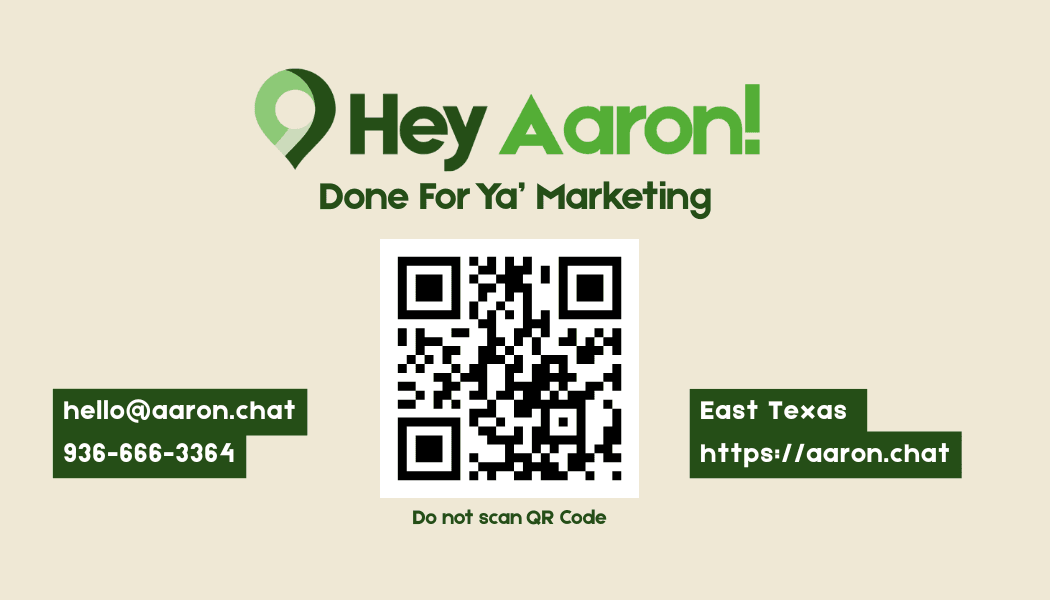
QR Code Analytics: Each card has a unique QR code that feeds straight into Google Analytics, so I can track scan rates, device types, and time of day.
UTM Parameters: Every link printed or shared is tagged with UTM source/medium/campaign values—letting me pinpoint which designs and contexts drive the most traffic.
Call Tracking: I use a dedicated tracking number on the cards; every inbound call gets logged and attributed, so I can measure which batch of cards produced conversations.
Sentiment Capture: When I hand out cards or write about the illusion on my blog, I jot quick notes on reactions (“Wow!” vs. “Huh?”) and monitor comments for qualitative feedback.
This mix of quantitative data and real-time sentiment ensures I’ll know exactly what’s resonating—and where to tweak next.

The Takeaway
Handing out another generic card is like shouting into a crowd. My autostereogram card? It’s a one-on-one ping at your curiosity. It:
- Grabs attention with a playful puzzle
- Breaks the ice by design
- Amplifies branding through intentional color use
- Drives real results in calls, conversations, and shares
So next time you see me handing out a card, get ready to squint—and stick around for the punchline. Because “Don’t Be Invisible” isn’t just a hidden phrase on a card; it’s the mantra I bring to every marketing strategy.